Bebas Neue
Free for commercial use

Uploaded by Pixel Sagas — Sans serif Typeface
Specimen image — coming soon
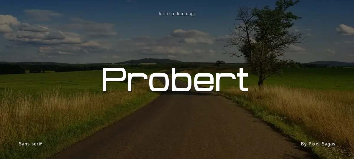
Probert - Black Italic
Probert - Black
Probert - Bold Italic
Probert - Bold
Probert - Condensed Black Italic
Probert - Condensed Black
Probert - Condensed Bold Italic
Probert - Condensed Bold
Probert - Condensed Italic
Probert - Condensed
Probert - Italic
Probert - Regular
abcdefghijklmnopqrstuvwxyz
ABCDEFGHIJKLMNOPQRSTUVWXYZ
0123456789 (!#$%&/.|*@?:;)
Typography
Great type turns words into design.
THE FIVE BOXING WIZARDS JUMP QUICKLY
the quick brown fox jumps over the lazy dog
$1,234.56 · 25% off · 09:45 AM · (2024) · #Fontlala
Every typeface has a voice. Some whisper, some shout — and the best ones say exactly what you mean before a single word is read.
Pick a font that fits your idea, set it with care, and let the letters do the talking. From bold headlines to the smallest caption, good type stays clear at every size — clean curves, even spacing, and characters that feel at home together.
A well-made font carries your message across posters, screens, packaging and print without ever getting in the way. That is the quiet craft of typography: structure you feel, but rarely notice. 0123456789 — the details matter.
Reporting Probert. Tell us what's wrong and we'll investigate.