
Korneuburg Slab Font
Uploaded by Flö Rastbichler — Serif Typeface
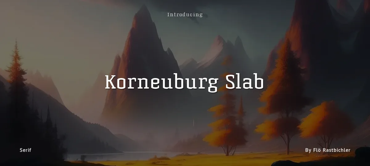
Specimen image — coming soon
- License
- Free for personal use
- Designer
- Flö Rastbichler
- Free for personal use
- Free for commercial use
Korneuburg Slab was created as a semester project at New Design University, St. Pölten, Austria. It's based on Korneuburg Display, a display/headline font i created in 2011, which was influenced by the neoclassicist city Korneuburg in Lower Austria and especially the forms of it's multiple archways. Korneuburg Slab retains those typical forms but focuses on great legibility, even in small sizes.
Korneuburg Slab - Korneuburg Slab Regular Slanted
Korneuburg Slab - Korneuburg Slab Bold
Korneuburg Slab - Korneuburg Slab Bold Slanted
Korneuburg Slab - Korneuburg Slab Light
Korneuburg Slab - Korneuburg Slab Light Slanted
Korneuburg Slab - Korneuburg Slab Regular
abcdefghijklmnopqrstuvwxyz
ABCDEFGHIJKLMNOPQRSTUVWXYZ
0123456789 (!#$%&/.|*@?:;)
Typography
Great type turns words into design.
THE FIVE BOXING WIZARDS JUMP QUICKLY
the quick brown fox jumps over the lazy dog
$1,234.56 · 25% off · 09:45 AM · (2024) · #Fontlala
Every typeface has a voice. Some whisper, some shout — and the best ones say exactly what you mean before a single word is read.
Pick a font that fits your idea, set it with care, and let the letters do the talking. From bold headlines to the smallest caption, good type stays clear at every size — clean curves, even spacing, and characters that feel at home together.
A well-made font carries your message across posters, screens, packaging and print without ever getting in the way. That is the quiet craft of typography: structure you feel, but rarely notice. 0123456789 — the details matter.
Report a violation
Reporting Korneuburg Slab. Tell us what's wrong and we'll investigate.