Deutschlander 2.0 Font

Uploaded by Sharkshock  — Sans serif Typeface

Specimen image — coming soon
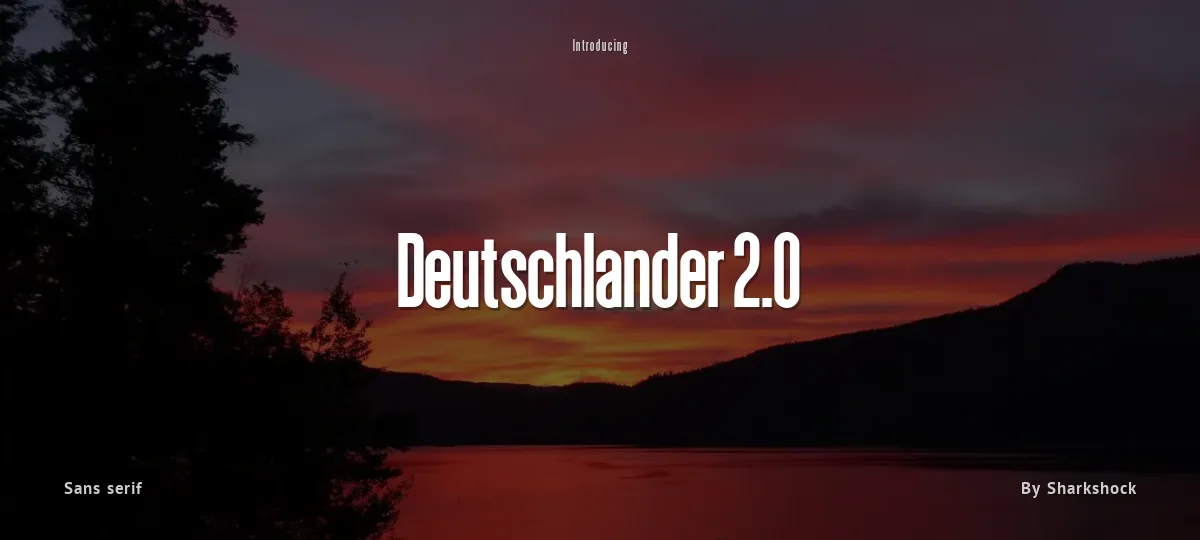
Deutschlander 2.0 font preview
License
Demo
Designer
Sharkshock
  • Free for personal use
  • Free for commercial use
Download OTF
OTF: Deutschlander 2.0 (Regular and Italic)
by Dennis Ludlow
Sharkshock 2019 all rights reserved
dennis@sharkshock.net

The next installment of the Deutschlander family gets a bit of a makeover in the 2.0 version. This display sans is a popular choice for squeezing text into tight spots like business cards, movie credits, or anywhere space is limited. The biggest differences include improved spacing, many redesigned characters, and support for more European languages. The full version is available in Regular and Italic. Basic Latin, extended Latin, diacritics, Cyrillic, Greek, punctuation, ordinals, fractions, alternates, and kerning are all included. Please check glyph maps for all supported characters. Basic Latin, numbers, and limited punctuation are available in the demo.

The full version is available for $25 (personal use only). For commercial licensing please contact us or visit this page: www.sharkshock.net/license Commercial usage without a valid license is strictly prohibited.

Thank you for your support!

Tags: vertical, tall, sans, display, basic, thin, Greek, French, German, Spanish, European, Russian, Cyrillic, display, accents, diacritics, logo, project, movies, movie, poster, book, publishing, lines, weight
Size

Deutschlander 2.0 - D

Deutschlander 2.0

abcdefghijklmnopqrstuvwxyz

ABCDEFGHIJKLMNOPQRSTUVWXYZ

0123456789   (!#$%&/.|*@?:;)


Typography

Great type turns words into design.

THE FIVE BOXING WIZARDS JUMP QUICKLY

the quick brown fox jumps over the lazy dog

$1,234.56 · 25% off · 09:45 AM · (2024) · #Fontlala


Every typeface has a voice. Some whisper, some shout — and the best ones say exactly what you mean before a single word is read.

Pick a font that fits your idea, set it with care, and let the letters do the talking. From bold headlines to the smallest caption, good type stays clear at every size — clean curves, even spacing, and characters that feel at home together.

A well-made font carries your message across posters, screens, packaging and print without ever getting in the way. That is the quiet craft of typography: structure you feel, but rarely notice. 0123456789 — the details matter.

A
B
C
D
E
F
G
H
I
J
K
L
M
N
O
P
Q
R
S
T
U
V
W
X
Y
Z
a
b
c
d
e
f
g
h
i
j
k
l
m
n
o
p
q
r
s
t
u
v
w
x
y
z
0
1
2
3
4
5
6
7
8
9
.
,
:
;
!
?
&
@
#
%
*
(
)
[
]
{
}
/
\
|
-
+
=
<
>
~
^
_
"
'
`
£
$
¥
©
®
°
§
«
»

You might also like