Copilme Font

Uploaded by Jef Triforce  — Sans serif Typeface

Specimen image — coming soon
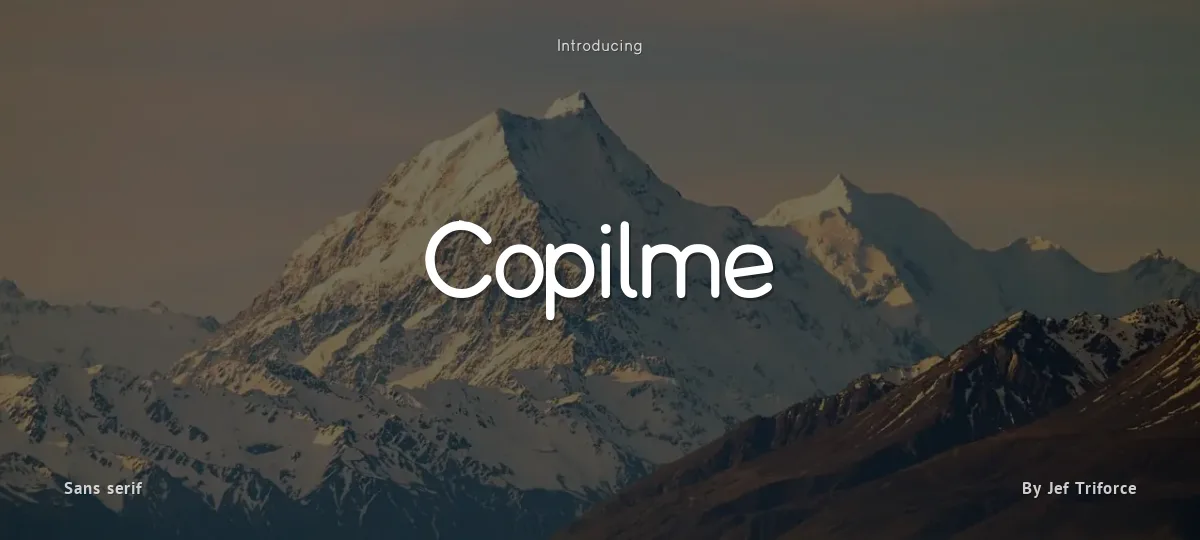
Copilme font preview
License
Free for personal use
Designer
Jef Triforce
  • Free for personal use
  • Free for commercial use
Download TTF
Copilme Font - by Ixipcalli.com

--EN--
A new update was released on August 12, 2025, replacing the lowercase Roman “a” with the italic “a” in order to improve its appearance in writing. Margins have been adjusted and new characters have been added. Unfortunately, DaFont has not updated to the latest version, but if you would like to obtain this new update, please go to the following link: https://www.ixipcalli.com/fonts/copilme.php

--ES--
Una nueva actualización ha sido publicada el día 12 de agosto del 2025, la cual se ha sustituido la «a» minúscula romana por la «a» itálica, esto con el fin de mejorar su aspecto en el uso de la escritura, se han ajustado márgenes y añadido nuevos caracteres. Lastimosamente en DaFont no han actualizado a la última versión, pero si deseas obtener esta nueva actualización por favor dirígete al siguiente link: https://www.ixipcalli.com/fonts/copilme.php
Size

Copilme - Light Italic

Copilme

Copilme - Regular

Copilme

Copilme - Bold

Copilme

Copilme - Bold Italic

Copilme

Copilme - Italic

Copilme

Copilme - Light

Copilme

abcdefghijklmnopqrstuvwxyz

ABCDEFGHIJKLMNOPQRSTUVWXYZ

0123456789   (!#$%&/.|*@?:;)


Typography

Great type turns words into design.

THE FIVE BOXING WIZARDS JUMP QUICKLY

the quick brown fox jumps over the lazy dog

$1,234.56 · 25% off · 09:45 AM · (2024) · #Fontlala


Every typeface has a voice. Some whisper, some shout — and the best ones say exactly what you mean before a single word is read.

Pick a font that fits your idea, set it with care, and let the letters do the talking. From bold headlines to the smallest caption, good type stays clear at every size — clean curves, even spacing, and characters that feel at home together.

A well-made font carries your message across posters, screens, packaging and print without ever getting in the way. That is the quiet craft of typography: structure you feel, but rarely notice. 0123456789 — the details matter.

A
B
C
D
E
F
G
H
I
J
K
L
M
N
O
P
Q
R
S
T
U
V
W
X
Y
Z
a
b
c
d
e
f
g
h
i
j
k
l
m
n
o
p
q
r
s
t
u
v
w
x
y
z
0
1
2
3
4
5
6
7
8
9
.
,
:
;
!
?
&
@
#
%
*
(
)
[
]
{
}
/
\
|
-
+
=
<
>
~
^
_
"
'
`
£
$
¥
©
®
°
§
«
»

You might also like