Blacker Sans Font

Uploaded by Zetafonts  — Sans serif Typeface

Specimen image — coming soon
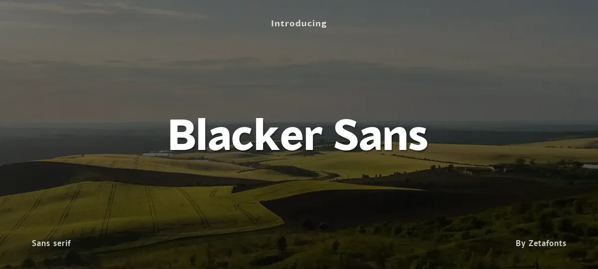
Blacker Sans font preview
License
Free for personal use
Designer
Zetafonts
  • Free for personal use
  • Free for commercial use
Download TTF
The font here is for PERSONAL/NON-COMMERCIAL USE ONLY!

To download the full font family (all weights, characters and numbers) and acquire the commercial license please visit our website:
https://www.zetafonts.com/blacker-sans

For more info about our licenses:
https://www.zetafonts.com/licensing

CONTACT US:
website: https://www.zetafonts.com
have a question?: info@zetafonts.com

---

Blacker Sans is Francesco Canovaro newest addition to the Blacker typeface family created for Zetafonts by Cosimo Lorenzo Pancini and Andrea Tartarelli after the inverse contrast Blackest. Born for flawless font pairing in complex branding and editorial projects, Blacker Sans parts with Blacker’s spiky wedge serifs without loosing its dark, elegant character while extending its weight range to include thin, extralight and heavy for maximum versatility in display use.
Contrast in the typeface is reduced to grotesque proportions, with optical corrections and fine design details to express the family identity. The result is a highly legible workhorse family that manages to keep the signature details of Blacker: the hook shape of lowercase “f” is hinted in “a”, “c” and “e”, while a nod to the original family spiky shapes appears in the ink-traps in “n”,”m”,”r”, “P” and “R”.   More...
This combination of a robust design skeleton with fine design details makes Blacker Sans suited for body text usage but still expressive when set in large size for display or logo use.
With its wide set of OpenType features ranging from ligatures (both standard and discretionary) to stylistic alternates, small caps, positional numbers, and alternate punctuation; and its 1000+ characters offering language support for over 200 languages using Latin, Cyrillic and Greek alphabets, Blacker Sans is ready to become your next best alternative to the same old boring grotesque sans typefaces for branding, editorial or digital design.
Size

Blacker Sans - Blacker Sans Extrabold Trial

Blacker Sans

Blacker Sans - Blacker Sans Extralight Italic Trial

Blacker Sans

abcdefghijklmnopqrstuvwxyz

ABCDEFGHIJKLMNOPQRSTUVWXYZ

0123456789   (!#$%&/.|*@?:;)


Typography

Great type turns words into design.

THE FIVE BOXING WIZARDS JUMP QUICKLY

the quick brown fox jumps over the lazy dog

$1,234.56 · 25% off · 09:45 AM · (2024) · #Fontlala


Every typeface has a voice. Some whisper, some shout — and the best ones say exactly what you mean before a single word is read.

Pick a font that fits your idea, set it with care, and let the letters do the talking. From bold headlines to the smallest caption, good type stays clear at every size — clean curves, even spacing, and characters that feel at home together.

A well-made font carries your message across posters, screens, packaging and print without ever getting in the way. That is the quiet craft of typography: structure you feel, but rarely notice. 0123456789 — the details matter.

A
B
C
D
E
F
G
H
I
J
K
L
M
N
O
P
Q
R
S
T
U
V
W
X
Y
Z
a
b
c
d
e
f
g
h
i
j
k
l
m
n
o
p
q
r
s
t
u
v
w
x
y
z
0
1
2
3
4
5
6
7
8
9
.
,
:
;
!
?
&
@
#
%
*
(
)
[
]
{
}
/
\
|
-
+
=
<
>
~
^
_
"
'
`
£
$
¥
©
®
°
§
«
»

You might also like