Biotrip Caps Font

Uploaded by deFharo  — Sans serif Typeface

Specimen image — coming soon
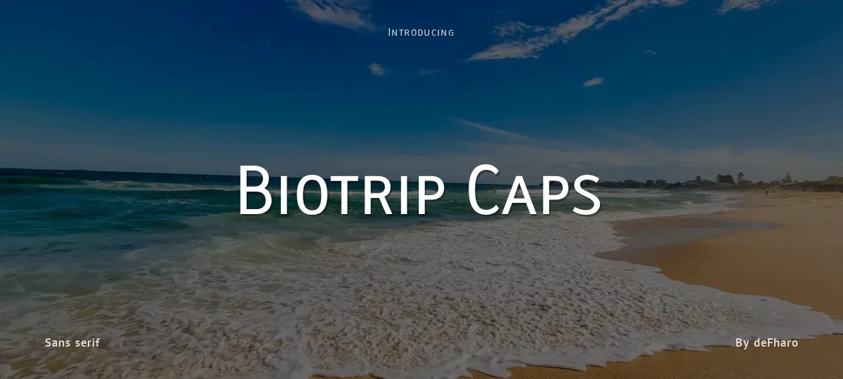
Biotrip Caps font preview
License
Free for personal use
Designer
deFharo
  • Free for personal use
  • Free for commercial use
Download TTF
Biotrip Sans Caps is a multipurpose typeface, refined down to the last detail. It includes seven weights—Light, Regular, Medium, Semi Bold, Bold, Extra Bold, and Black—that allow for the creation of solid, adaptable, and expressive visual systems.

Each variant has been carefully designed to preserve the humanist essence of Biotrip Sans, with the authority of capital letters.

In Biotrip Sans Caps, I explore the tension between control and gesture, between rational form and human touch.

It is this warmth that breaks the coldness of the pixel and establishes a real, almost tactile, connection with the reader.

Its construction is organic and vibrant, with flowing curves.

The forms are open and welcoming, designed to offer excellent legibility in small sizes, but also to support large headlines with character, balance, and presence.

=========================
DOWNLOAD FULL VERSIONS & LICENSES: https://defharo.com/fonts/biotrip-sans-caps/
=========================
Size

Biotrip Caps - Bold

Biotrip Caps

Biotrip Caps - Regular

Biotrip Caps

abcdefghijklmnopqrstuvwxyz

ABCDEFGHIJKLMNOPQRSTUVWXYZ

0123456789   (!#$%&/.|*@?:;)


Typography

Great type turns words into design.

THE FIVE BOXING WIZARDS JUMP QUICKLY

the quick brown fox jumps over the lazy dog

$1,234.56 · 25% off · 09:45 AM · (2024) · #Fontlala


Every typeface has a voice. Some whisper, some shout — and the best ones say exactly what you mean before a single word is read.

Pick a font that fits your idea, set it with care, and let the letters do the talking. From bold headlines to the smallest caption, good type stays clear at every size — clean curves, even spacing, and characters that feel at home together.

A well-made font carries your message across posters, screens, packaging and print without ever getting in the way. That is the quiet craft of typography: structure you feel, but rarely notice. 0123456789 — the details matter.

A
B
C
D
E
F
G
H
I
J
K
L
M
N
O
P
Q
R
S
T
U
V
W
X
Y
Z
a
b
c
d
e
f
g
h
i
j
k
l
m
n
o
p
q
r
s
t
u
v
w
x
y
z
0
1
2
3
4
5
6
7
8
9
.
,
:
;
!
?
&
@
#
%
*
(
)
[
]
{
}
/
\
|
-
+
=
<
>
~
^
_
"
'
`
£
$
¥
©
®
°
§
«
»

You might also like