Beatrix Antiqua Font

Uploaded by Zetafonts  — Sans serif Typeface

Specimen image — coming soon
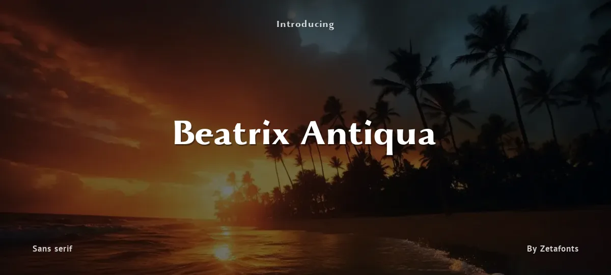
Beatrix Antiqua font preview
License
Free for personal use
Designer
Zetafonts
  • Free for personal use
  • Free for commercial use
Download TTF
Beatrix Antiqua is a humanist sans-serif typeface designed by Francesco Canovaro. Beatrix Antiqua is part of the Beatrix Family that takes its inspiration from the classic Roman monumental capital model: its capitals are directly derived from the stone carvings in Florence Santa Croce Cathedral - where the serifs are often removed while keeping the variable width strokes. So, even if it's basically a sans-serif, Beatrix keeps a subtle swelling at the terminals suggesting a glyphic serif - in the same vein as Herman Zapf classic Optima typeface. In the lowercase design, Beatrix references early humanist typefaces, keeping small calligraphic details (as the prolongation of the e nose) that are expecially visible in the italics. While Beatrix Antiqua, the companion typeface to Beatrix Nova, slightly exaggerates its antique stylistical features, Beatrix Antiqua tries to mix those influence with a classic design, featuring lower X-height and an extended character set that covers over fourty languages using the latin alphabet, as well as Greek and Russian Cyrillic.
----------------------------

This trial font is TOTALLY FREE for NONCOMMERCIAL USES.

For commercial uses and to download the full commercial typeface visit
http://www.zetafonts.com/beatrix-antiqua

----------------------------

Have a question?: info@zetafonts.com
Size

Beatrix Antiqua - Bold Trial

Beatrix Antiqua

Beatrix Antiqua - Bold Italic Trial

Beatrix Antiqua

Beatrix Antiqua - Thin Trial

Beatrix Antiqua

Beatrix Antiqua - Thin Italic Trial

Beatrix Antiqua

abcdefghijklmnopqrstuvwxyz

ABCDEFGHIJKLMNOPQRSTUVWXYZ

0123456789   (!#$%&/.|*@?:;)


Typography

Great type turns words into design.

THE FIVE BOXING WIZARDS JUMP QUICKLY

the quick brown fox jumps over the lazy dog

$1,234.56 · 25% off · 09:45 AM · (2024) · #Fontlala


Every typeface has a voice. Some whisper, some shout — and the best ones say exactly what you mean before a single word is read.

Pick a font that fits your idea, set it with care, and let the letters do the talking. From bold headlines to the smallest caption, good type stays clear at every size — clean curves, even spacing, and characters that feel at home together.

A well-made font carries your message across posters, screens, packaging and print without ever getting in the way. That is the quiet craft of typography: structure you feel, but rarely notice. 0123456789 — the details matter.

A
B
C
D
E
F
G
H
I
J
K
L
M
N
O
P
Q
R
S
T
U
V
W
X
Y
Z
a
b
c
d
e
f
g
h
i
j
k
l
m
n
o
p
q
r
s
t
u
v
w
x
y
z
0
1
2
3
4
5
6
7
8
9
.
,
:
;
!
?
&
@
#
%
*
(
)
[
]
{
}
/
\
|
-
+
=
<
>
~
^
_
"
'
`
£
$
¥
©
®
°
§
«
»

You might also like